ARGO | INSURTECH
Design System for Insurtech Designers
How do we get five designers on a shared product language?
An outdated and barely used UI toolkit
An insurance carrier’s digital team had built multiple platforms with various design styles and languages.
While a UI toolkit existed, it was hard for both designers and engineers to use and find components, so many designers would create custom styles. This led to inconsistency across many products.

Varied & inconsistent experience
Inconsistency of common patterns across different applications

Hard to use components
Difficult to use Sketch components meant designers just made their own

Poor documentation for everyone
Minimal and outdated documentation meant developers and designers had difficultly knowing how and when to use components.
Defining our Experience Values & Design Principles
To ensure our components were in-sync with how our customers, team members, and key stakeholders viewed the company, I wanted to ground our design system in Experience Values.
I interviewed underwriters and the operations lead to learn more about the current onboarding process, as well as understand more about the relationship between Argo underwriters and their broker partners.

Remote-first Collaborative Design Sprint
I facilitated a 2 week-long design sprint (entirely via Figma and Zoom) among design team to design and align upon over 22 different components and patterns.
For the first time, the design team had a single, cohesive experience to be implemented across our products.


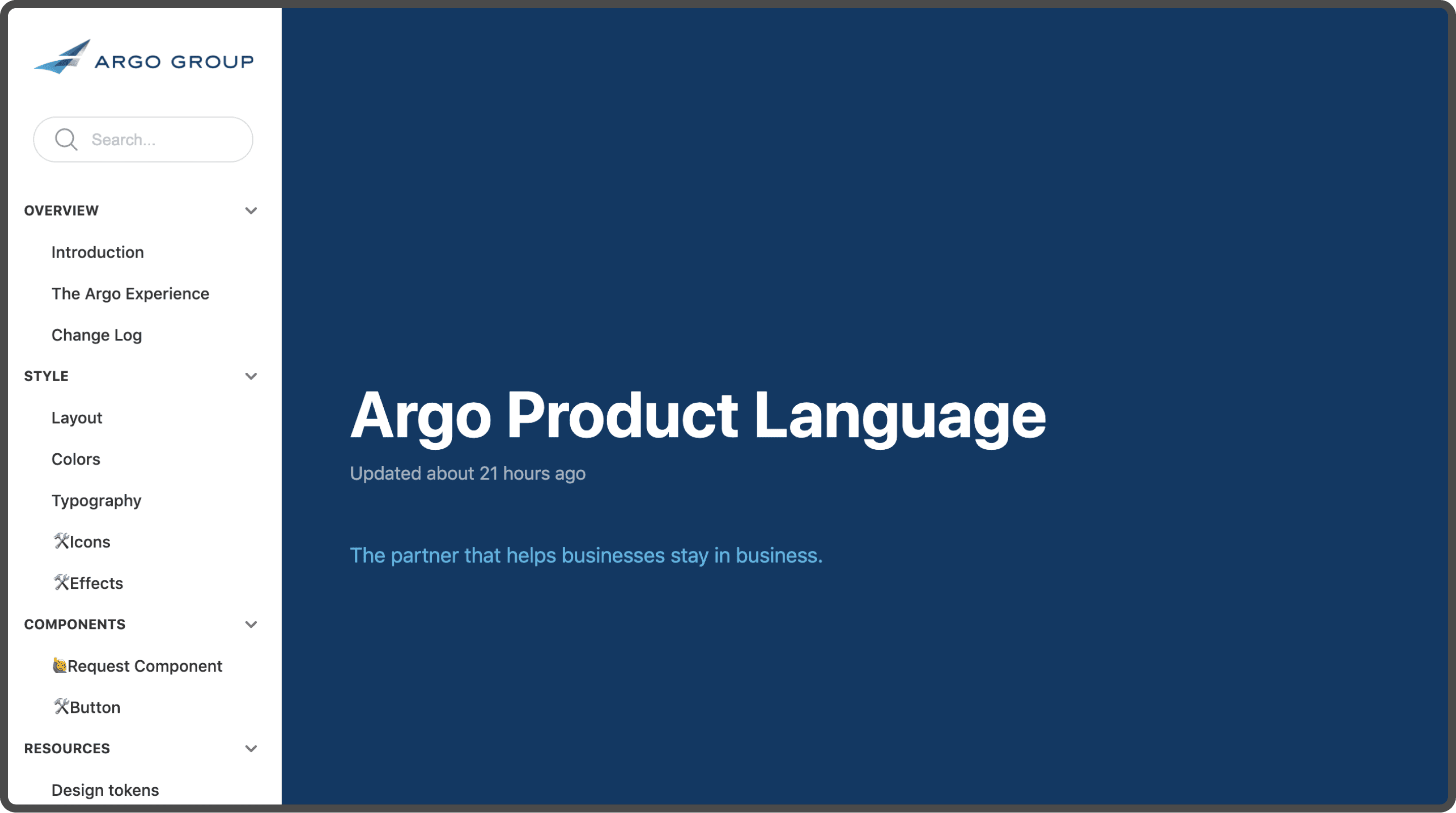
The Argo Product Language
A cohesive and shared experience, built from experience values


We are approachable
Soft corners to promote approachability and make the experience feel familiar and less intimidating.
We are responsive
Clear and accessible labels provide information directly, so there’s no confusion about what someone needs to do.
We are trusted guides
Borders, backgrounds, and content areas to provide focus. Clear states so people know where they are.
We are experts with the unique
Flexible enough to scale and customize based on shared principles, patterns, and styles.
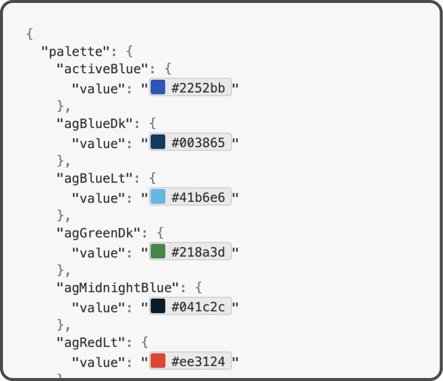
Design tokens to scale consistency across organization

Focus on clarity and efficiency for designers

Clear Documentation
Every component, style, state, and interaction documented clearly so any designer or engineer knows exactly how a component behaves and should be used.

Built for scale & flexibility
Each component is built in Figma specifically with the designer in mind. Components have flexible options built directly in, making it easier for designers to adapt any component to their specific use case -- all while staying within guidelines.
Results: Cohesive Experience, Less Waste
Internal Stakeholder Alignment
The design system process brought a level of transparency and alignment not seen before with regards to design, including across stakeholders such as Communications & Marketing
Designers using same components and shared styles
All designers are using the new design system components for new initiatives and products, creating a more cohesive overall experience for our users.