THe home depot | martech
Content Management System for Designers
How do we support a web designer’s creativity while ensuring brand standards?
An unsupported product that users hated
The in-house content management system — that powered all the content on The Home Depot's site — had not been improved upon since it’s initial launch 3 years prior.
Content Designers hated using the CMS, wanting something that was "more like Photoshop, but would make websites" - suggesting a misalignment around the purpose of a CMS.
Understanding what 'content mgmt' means at THD
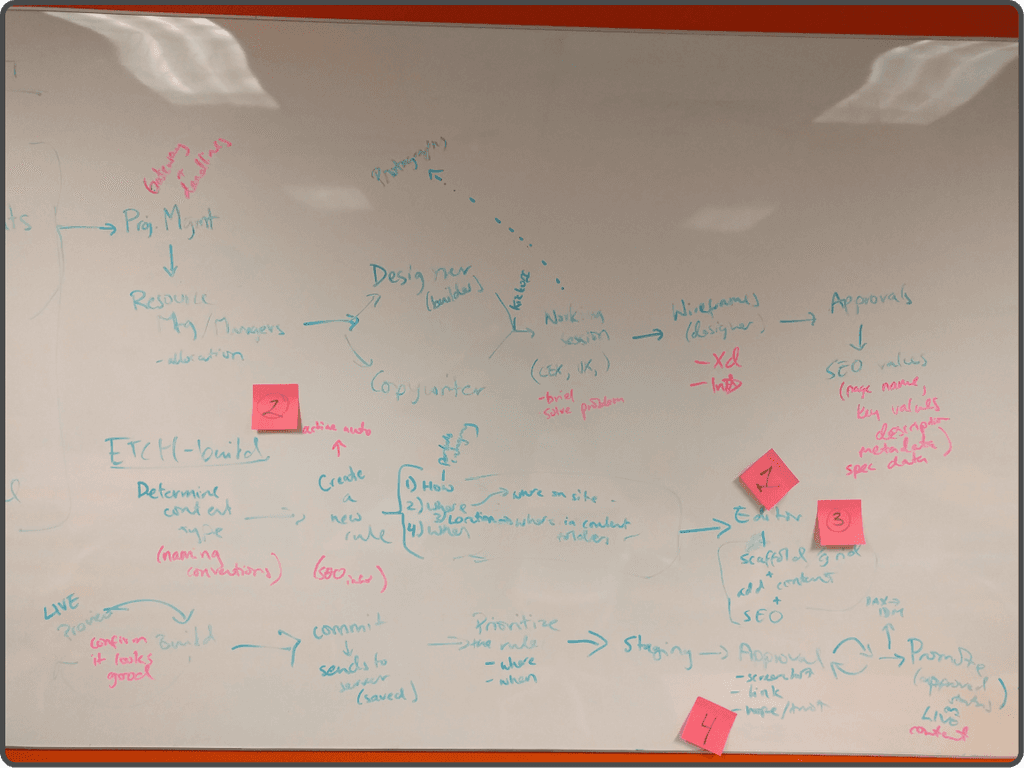
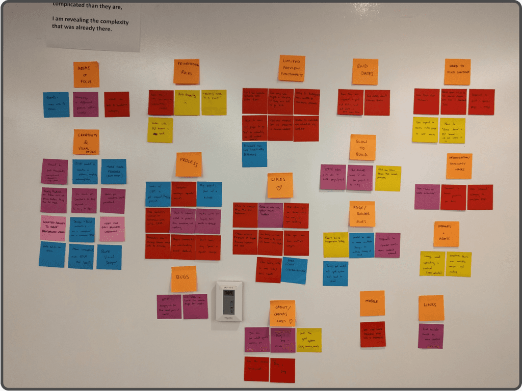
First, I facilitated a workshop with people from SEO, Content, Marketing, and Tech/Design to help align on direction and provide a deeper understanding the broader content management strategy. This was the initial breakdown of the process for how 'content gets made' at Home Depot.
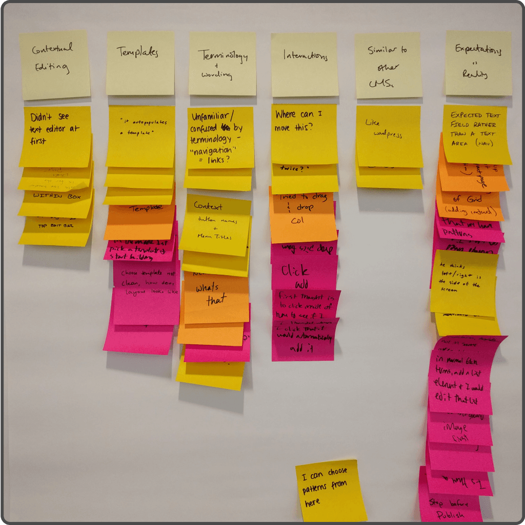
I conducted 14 in-depth interviews and 5 contextual observations with web designers to uncover their pain points, understand their design process, and their current interactions with the tool.
This research uncovered tension between 'unlimited creativity' desired by Content Designers with the Marketing & Tech teams desire for standards & efficiency.
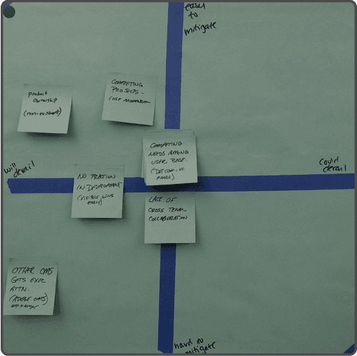
Collaboratively design & test with users
I led a design studio to brainstorm solutions with product & engineering team & users. Not only did this generate a lot of ideas quickly, but it also brought our Content Design users into the process directly.
I then tested multiple iterations of prototypes with Content Designers, with my engineering team shadowing these tests to see directly how users interacted with the UX.
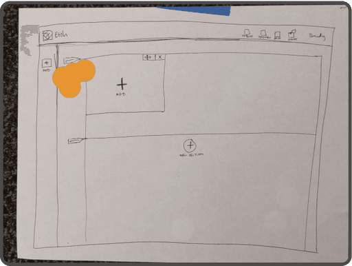
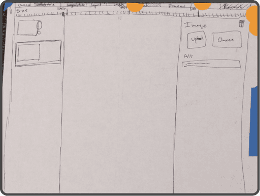
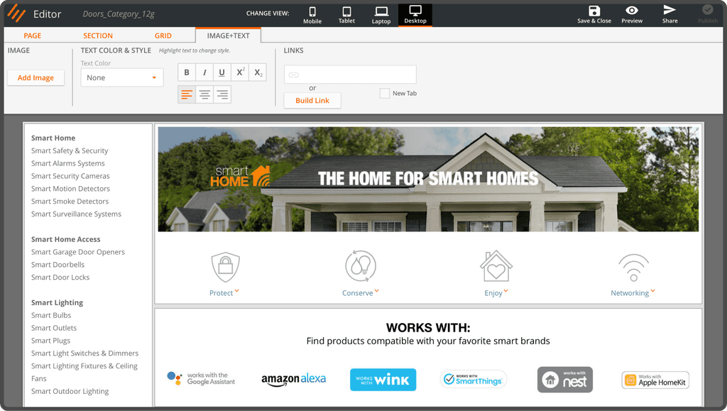
Reducing clutter to focus on the user’s design - not the product’s
Contextual UI
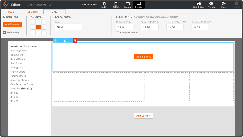
Grid & section lines hidden unless selected. Removed the side menus and replaced with a contextual top menu give more room to the canvas.
In-canvas contextual menus to maintain user focus on their work, rather than hunting for the right button.
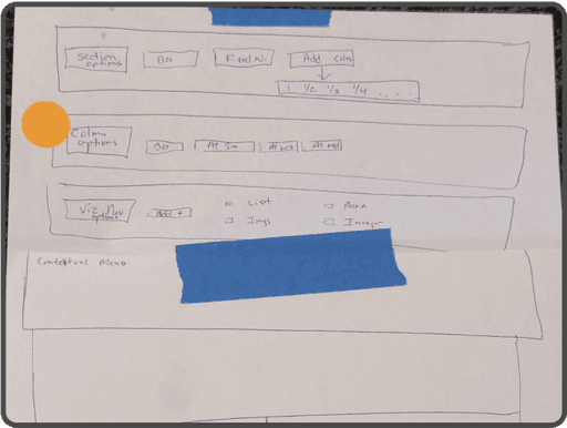
Pronounced interaction & style
Clearer interaction points for users reduces “misclicks.”
Bold use of “off-brand blue” to mark distinction between content and system UI
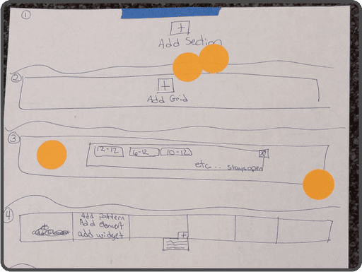
Guided creation experience to align with content strategy
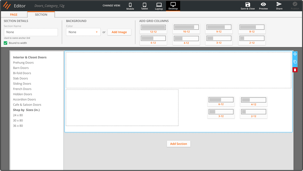
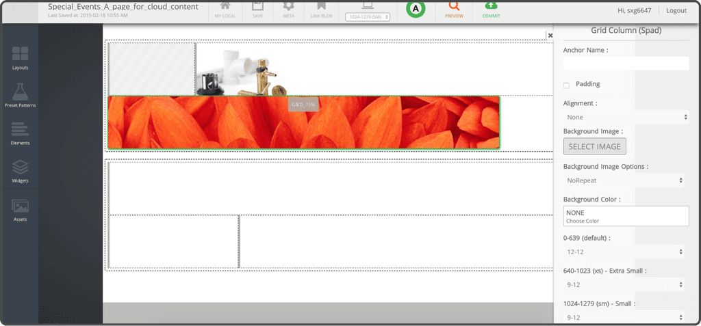
Emphasize the grid
Guiding the user encourages a more accurate grid structure (reducing need to “do math” and just focus on page layout)
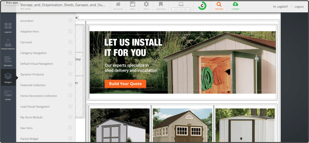
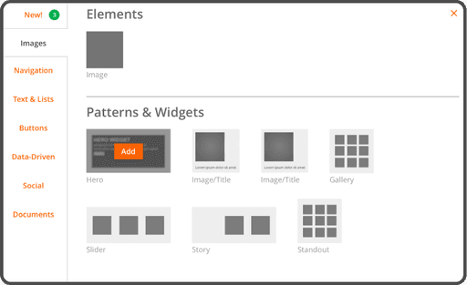
Refocus on reusable patterns
Re-organizing and grouping the pattern library to ensure standards and help users find the right pattern quicker. Patterns designed in tandem with Content Designers + UX team
Results: Less errors, more alignment
Less publishing errors
Reduced human error and increased efficiency to create pages, reducing likelihood of serious errors on retail site.
Happier users
Increase in “positive product perception” by users and stakeholders, with users becoming champions for the new system.
Defining content management
Clear alignment on content management as a practice, with users & stakeholders beginning to see content as patterns, data, and objects